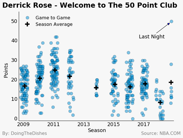
Derrick Rose Joins the 50 Point Club
On October 31st, 2018, I was watching a basketball game between the Utah Jazz and Minnesota Timberwolves. Being an avid Jazz fan,I felt confident that Jazz would get a victory. Derrick Rose was recently traded to the Timberwolves, and I remember that I was surprised that he was still in the league after a few down years and so many injuries. Additionally, I was sure he would not have a big role in the game, and thought he may not even play.
This could not have been further from the truth. Rose scored a career high 50 points. Yes, more points than he scored in any game during his MVP season. His previous career was 42, in 2011. To top it all off, the Jazz lost the game, largely in part to Rose’s incredible game.
Final score 128-125.
Check out the code below to see how we gathered, cleaned and plotted each game in Derrick Rose’s career. Make sure to scroll to the very bottom to see the plot. All data was taken from nba.com.
import pandas as pd
import numpy as np
import matplotlib.pyplot as plt
import time
import requests

%matplotlib inline
u_a = "Mozilla/5.0 (X11; Linux x86_64) AppleWebKit/537.36 (KHTML, like Gecko) Chrome/67.0.3396.87 Safari/537.36"

def playergamelogs(PlayerID,DateFrom='',DateTo='',GameSegment='',LastNGames='0',LeagueID='00',
                   Location='',MeasureType='Base',Month='0',OpponentTeamID='0',Outcome='',
                   PORound='0',PaceAdjust='N',PerMode='Totals',Period='0',
                   PlusMinus='N',Rank='N',Season='2018-19',
                   SeasonSegment='',SeasonType='Regular Season',ShotClockRange='',
                   VsConference='',VsDivision=''):
    url = 'https://stats.nba.com/stats/playergamelogs?'
    api_param = {
        'DateFrom' : DateFrom,
        'DateTo' : DateTo,
        'GameSegment' : GameSegment,
        'LastNGames' : LastNGames,
        'LeagueID' : LeagueID,
        'Location' : Location,
        'MeasureType' : MeasureType,
        'Month' : Month,
        'OpponentTeamID' : OpponentTeamID,
        'Outcome' : Outcome,
        'PORound' : PORound,
        'PaceAdjust' : PaceAdjust,
        'PerMode' : PerMode,
        'Period' : Period,
        'PlayerID' : PlayerID,
        'PlusMinus' : PlusMinus,
        'Rank' : Rank,
        'Season' : Season,
        'SeasonSegment' : SeasonSegment,
        'SeasonType' : SeasonType,
        'ShotClockRange' : ShotClockRange,
        'VsConference' : VsConference,
        'VsDivision' : VsDivision,
        }
    response = requests.get(url,params=api_param,headers={"USER-AGENT":u_a})
    data = response.json()
    return pd.DataFrame(data['resultSets'][0]['rowSet'],columns=data['resultSets'][0]['headers'])

def seasons_string(start,end):
    '''
    creates a list of NBA seasons from start-end
    '''
    years = np.arange(start,end+1)
    seasons = []
    for year in years:
        string1 = str(year)
        string2 = str(year+1)
        season = '{}-{}'.format(string1,string2[-2:])
        seasons.append(season)
    return seasons
plt.style.use('classic')

def nice_plot(xlabel='',ylabel='',title='',subtitle='',
              name = 'By: DoingTheDishes',source = 'NBA.COM',
              figsize=(1.33*8,8),bg_color='white'):

    fig = plt.figure(figsize=figsize)

    fig.set_facecolor(bg_color)

    # create labels and title for figure
    fig.text(0.01,0.01,name,fontsize=14.0,color='gray',
             horizontalalignment='left',verticalalignment='bottom')
    fig.text(0.99,0.01,'Source: '+source,fontsize=14.0,color='gray',
             horizontalalignment='right',verticalalignment='bottom')

    fig.text(0.01,0.99,title,fontsize=22.0,
            horizontalalignment='left',weight="bold",verticalalignment='top')

    fig.text(0.01,0.93,subtitle,transform=fig.transFigure,fontsize=16.0,
            horizontalalignment='left',verticalalignment='top')

    fig.text(0.53,0.048,xlabel,fontsize=16.0,color='black',
                   horizontalalignment='center',verticalalignment='center')

    fig.text(0.03,0.495,ylabel,fontsize=16.0,color='black',
                   horizontalalignment='center',verticalalignment='center',rotation=90)

    ax_left = 0.1
    ax_bottom = 0.12
    ax_width = 0.85
    ax_height = 0.8

    ax = fig.add_axes([ax_left,ax_bottom,ax_width,ax_height])
    ax.set_facecolor(bg_color)
    #ax.grid('on', linestyle='--',color='gray')
    ax.spines['top'].set_visible(False)
    ax.spines['right'].set_visible(False)
    ax.axes.tick_params(length=0)
    ax.tick_params(labelsize=16)

    return fig,ax

colors = ['#008fd5', '#fc4f30', '#e5ae38', '#6d904f', '#8b8b8b', '#810f7c']
Get Data:
rose_id = 201565
data = []
for season in seasons_string(2008,2018):
    data.append(playergamelogs(rose_id,Season=season))
    print(season)
    time.sleep(1.0)
2008-09
2009-10
2010-11
2011-12
2012-13
2013-14
2014-15
2015-16
2016-17
2017-18
2018-19
data = pd.concat(data,ignore_index=True)
Data cleaning
data['GAME_DATE'] = pd.to_datetime(data['GAME_DATE'])
data['PTS'] = pd.to_numeric(data['PTS'])
data = data.sort_values(by='GAME_DATE')
data = data.set_index('GAME_DATE')
import matplotlib.dates as mdates
Season averages
season_avg = data.groupby('SEASON_YEAR')['PTS'].mean()
Prepare season averages data for plotting
import datetime as dt
x2 = [dt.datetime(2009,2,1),dt.datetime(2010,2,1),dt.datetime(2011,2,1),
     dt.datetime(2012,2,1),dt.datetime(2013,11,1),
     dt.datetime(2015,2,1),dt.datetime(2016,2,1),dt.datetime(2017,2,1),
     dt.datetime(2018,2,1),dt.datetime(2018,10,20)]
y2 = season_avg.tolist()
Plot data:
fig,ax = nice_plot(xlabel='Season',ylabel='Points',
                   title='Derrick Rose - Welcome to The 50 Point Club',subtitle='',
                  name = 'By: DoingTheDishes',source = 'NBA.COM',
                  figsize=(8,6),bg_color=(0.97,0.97,0.97))

x = data.index
ax.plot_date(data.index,data['PTS'],'o',alpha=0.5,markersize=10,color=colors[0],label='Game to Game')
ax.annotate('Last Night', (mdates.date2num(x[-1])-25, 49.5), xytext=(-100, -50),fontsize=16,
            textcoords='offset points', arrowprops=dict(arrowstyle='-|>'))
ax.set_xlim([mdates.date2num(x[0])-50,mdates.date2num(x[-1])+50])
ax.set_ylim([-1,55])
ax.set_xticklabels(['2009','','2011','','2013','','2015','','2017']);

ax.plot_date(x2, y2,'k+',ms=14,mew=4,label='Season Average')

leg = ax.legend(loc='upper left',numpoints = 1)
frame = leg.get_frame()
frame.set_facecolor((0.97,0.97,0.97))
frame.set_edgecolor((0.97,0.97,0.97))

fig.savefig('Rose.png',bbox_inches='tight',facecolor=fig.get_facecolor(), edgecolor='none')

Work done by Adam Reynolds, Tim Long and Eyal Shafran
